
One of the most popular email design trends among top-notch email developers these days is the accessibility of their messages. As we move towards getting back to our normal lives, we have learned the importance of being connected with each other and sharing empathy. As email designers, if any of our subscribers isn’t able to access your message, it would be a setback to the organization and an unpleasant experience to the recipient. If you are looking to understand which aspects impact the design deliverability, you’re at the right place. Today, I will share the email design parameters that you need to keep in mind for building highly accessible email templates in the below sections:
Why Accessibility Matters In Email Design
As email marketers, we spend a lot of time to and effort to create email template and building a high-quality list and keep adding more subscribers to it. Almost 1 billion people suffer from a form of disability. Also, the global user base for emails is estimated to be 4.147 billion, which makes it quite possible that many of your subscribers would be facing a disability, making it difficult for them to access your messages. Also, the rise of voice assistants is making it necessary for businesses to send messages compatible with Alexa, Siri, Google Assistant, and Cortana. Also, we have to keep disabilities like color blindness in mind for making the emails more accessible.
There are many simple methods like keeping visual hierarchy consistent and easily perceivable subject lines and email copies, but people with disabilities require special provisions to make consumption easy. Generally, this is made possible by modifying your email template design. Here are the design tactics that will help maintain high accessibility:
Use HTML Language Attribute And Encode The Characters
Another coding change that helps screen readers understand your messages is using the lang=“” HTML attribute to notify the language. For instance, if you are using English, you should add lang=“en” to enhance the accessibility of your message. You may also insert the code “<meta http-equiv=”Content-Type” content=”text/HTML; charset=utf-8″>” inside the template to encode characters. This improves the consistency while reading your message as well as helps screen readers navigate.
Implement ARIA For Your HTML Codes
When coding your custom email templates, you should go for implementing AIRA (Accessible Rich Internet Applications) as it further improves your accessibility score. Under ARIA, you have to define the roles of different aspects like role=“img”, role=“listitem”, role=“article” since most of the email clients improve the user experience based on it. While all email clients don’t support every ARIA role, it still makes your messages fairly accessible. Also, it improves user experience since the recipient will be able to hear your message in a format familiar to their screen reader’s working pattern due to proper structuring.
Use Alt Tags For Your Images And Other Rich Media
This is one of the most common ways to increase the accessibility of your messages: adding alt texts. An alt text is a small piece of information displayed when the media on your email isn’t loaded properly. It is used to describe the media and the screen readers/smart assistants also read them out since the subscriber is going to listen to your messages. Make it a point to add alt text for all your images and other rich media such as GIFs and videos. It is also necessary that your messages make full sense of their own without using the images since a lot of email users read their messages with images turned off.
Be Smart With Your Color Palette
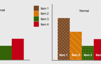
One of the most common mistakes made while designing emails is using color palettes, making it difficult to read the email. If you don’t use the correct color contrast, your readers will struggle with reading the content. For instance, using white fonts in a grey background will reduce your message’s readability to a large extent. Here’s an example of good and bad color contrasts:
Also, W3 Org has defined principles to make digital properties more friendly for users with low vision. It is recommended to use contrasting colors to help your subscribers suffering from color blindness since they face this type of difficulty:
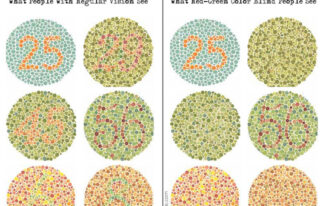
Thus, contrasting colors will make the situation better for them:
Summing Up
Accessibility is a vast topic, and it is difficult to cover entirely for any email designer. However, you can incorporate these tips in your template development process for reaching out to the maximum number of people. You may also hire email design services from agencies like Uplers since they have professionals who can help you with even the most intricate design components. I hope you find this article on improving the accessibility of your emails insightful.
Author Bio: Kevin George is Head of Marketing at Email Uplers, one of the fastest growing custom email design and coding companies, and specializes in crafting professional email templates, PSD to HTML email conversion and free HTML email templates. He loves gadgets, bikes, jazz and eats and breathes email marketing. He enjoys sharing his insights and thoughts on email marketing best practices on his blog.